Sunday, April 16, 2017
Major and Minor Tasks
Trailer #1: Unconventional
https://drive.google.com/file/d/0B7bb6k3muYIwYlBTaHRjWHdGaFE/view?usp=sharing
Trailer #2: Conventional
https://drive.google.com/file/d/0B7bb6k3muYIwdHV0ZTlpa3ljN2s/view?usp=sharing
Website: https://amygallagher7.wixsite.com/theorder
Poster:

https://drive.google.com/file/d/0B7bb6k3muYIwYlBTaHRjWHdGaFE/view?usp=sharing
Trailer #2: Conventional
Website: https://amygallagher7.wixsite.com/theorder
Poster:

The Home Stretch
Ah here we are, hours away from the due date. Yet again, I'm working up until the last minute but I low key like the pressure and the thrill of it. I also wanted to take all of the time possible to perfect everything. I uploaded one of my trailers, and the other is exporting as we speak. I even had time to make cute little thumbnails for each! I finished my poster yesterday after much distress; I don't have Photoshop so designing the poster slightly more difficult. But don't you worry I handled it! I crafted half of it on Canva and finished the rest of it on Word. I finished my website this morning; my one major issue is that my trademark font for the title wasn't available on Wix, so I had to improvise. I just used the closest font to the original. It isn't quite the same, but it will have to do. I also created a logo for the production company of the film, Oakmont Productions. This gave the trailers a much more professional feel.

I chose to add cinema bars to my more conventional trailer, as trailers for major motion pictures have them. I chose not to include them in my unconventional trailer so more attention could be paid to the visuals. On the note of editing, I almost chose to change the font of the textual graphics in my conventional trailer. The font I used for them is the same as the font for the title. I considering changing it because it might be considered too hard to read; though, I kept it for branding purposes.
All that is left is my CCR. I wrote my script and some notes a couple days ago. I recorded my voice-overs that will pair with screen casts, which are the only thing I have left to do. Well, that's pretty much it, it's all coming to a close. (Sheds tear)
Saturday, April 15, 2017
Everyone Loves A Good Vlog
Sunday, April 9, 2017
Real Quick...

Real quick before I start filming again, I realized I didn't get to talk about mise-en-scene inspiration!
Even though I am having my piece take place in the present, I still want to have older, or more traditional, elements in the environment. This first piece I thought of for inspiration was Darren Aronofsky's The Fountain. I always loved the yellow, green, and orange hues throughout the film, and of course the symbolic contrast between lightness and darkness. The scene in particular, was the opening scene when Tomas was praying at a small alter. I want to employ similar techniques and create symmetry within the shots, and have the main subject be off center to imply that he is atypical and doesn't fit in.

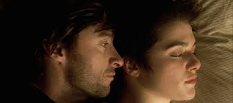
I also find Aronofsky's CUs to simply yet beautifully capture the subjects. After my first days of shooting and examining my footage, there isn't enough variety in my shots so I think CUs and even ECUs will make the trailers more appealing to watch. Aronofsky also manipulates shadows to create depth within each shot. In addition, he uses shallow focus to make the point of the shots very clear.

 In addition to shots and coloring, let's talk wardrobe! I was a little confused about what to have my actors wear. Since I am taking on a contemporary time period, I didn't need to buy or make any classical robes (very thankful about this). The narrative will focus on the boys in their studies and daily activities, not necessarily in mass, so this made costuming more lax. All of the actors I retrieved have very different styles so I had to think of something all of them would have and that was also in line with my vision. I decided to just have the boys wear slacks and button-down shirts. This way they still look conservative and put together, but it still allows for their different personalities and has modern elements. For example, Jason came in with the top buttons undone but I decided that it actually went well with his character and created some diversity. I also had to consider my audience and fellow teens, Generation Z! We are a fashionable bunch (especially those crazy hipsters) so in much of the media we consume, we prefer attractive costuming to authenticity. A perfect example is The CW's Reign, which tells the story of the French throne and all of the juicy details. The show takes place in 16th century France, yet all of the ladies have beautiful gowns that are everything but historically accurate. Though, fans of the show recognize this but look past it because they are so invested in the narrative. Therefore, I have some room for the guys to add in some of their own personal style. Though, in the one scene with all of the guys in the church at their induction ceremony, I do want them to be wearing black polos and I will make them priest collars. This scene in one of the more religious scenes so I want to be as respectful and accurate as possible.
 |
Historically accurate? Not at all. Possible prom dress? Absolutely.
What Would This Be Without Problems?
 |
| Wonky shadows, mysterious blue hues, uncomfortably framed |

The scene I spent most of my time filming was the dramatic dinner scene. When I was imaging the scene and storyboarding, I had the table filled with 5-6 priests. Though due to scheduling, I couldn't round up enough actors for this scene. I thought that if I used tighter shots, it wouldn't be obvious, but even so it looks awkward and lame. Therefore, I am going to get some more male friends to help me out. When I film this scene again, it should go a little quicker because I already have an idea of what shots I want. Another issue I had with this scene was that the light fixture in my dining room was too low, so it was partially in a couple of the shots. The whole setup of my dining room ended up being more difficult to maneuver than I thought, so I am planning on using my neighbors dinner table. Her house is a bit more modern, but I could easily manipulate it to fix my miss-en-scene. The lighting in her house is more ideal because it had whiter and cooler hues rather than my house that has yellow hues.
The scenes that I filmed with Diego came out good! I successfully captured shots of him in his room, reflectively writing in his journal and also a couple of him sitting under a tree as he reconsiders his life's purpose.
This coming week is spring break (whoop whoop!!) so all of my actors are available (whoop whoop!!!!) I get back from New York on Monday night, so I plan on filming all day Tuesday and finishing up on Wednesday. Tuesday, I am taking the gang down to my church where we can get some shots. My friends mom is a teacher at the school connected to my church and she said we could use her classroom if we need to. Then I'll edit all day Thursday and finish up my website and poster.
Saturday, April 8, 2017
Posters
Naturally, I can't just think about what I'm doing at the moment, I need to think about what's next; I'm in the filming process but I can't help but start planning my website and poster. I won't lie, I'm not the biggest fan of making websites because I feel like the ones I make are always ugly and unorganized. I have made movie posters before, using simple templates but I want this one to be clean, crisp, and professional. In the past, I have just used a still from the piece but after looking up film posters, most include a separate photo. I definitely want to use the conventions for my poster, so I plan on doing
something similar.


something similar.


I found a simple website that could help me construct my own poster. From many drama film posters that I have seen, usually the main character is the subject of the poster. I envision either a CU of Gabriel looking into camera, or a MS of his body, from the neck down. With the latter, it would be a little more interesting because it isn't revealing the face of the main character, therefore leaving some part unknown. Classic GenZ will be so intrigued with the person and why their face isn't shown that they might go out and find the film.


I want to use the conventions but I want my poster to be original enough to get attention; the Moonlight poster is an excellent example. It used the basic conventions of a film trailer, but the image itself was to well-thought out, simple, to the point, and not to mentioned eye-catching. 10/10 to their market team because people are still talking about the poster. Even though my Photoshop skills are a solid mediocre, I want to try and attempt to make a poster that is new and enticing. This will help to aid in my branding; The Order will use traditional conventions of drama but it also
is new and innovative in the narrative.
is new and innovative in the narrative.
Subscribe to:
Posts (Atom)